Friday, 22 January 2016
Evaluation Questions 1-4 Wix Website
I've presented evaluation questions 1-4 on a Wix website, each question is presented on a different page. Here is the link
http://ab074409.wix.com/social-media-blog#!evaluation-4/iut9o
http://ab074409.wix.com/social-media-blog#!evaluation-4/iut9o


Thursday, 21 January 2016
Thursday, 14 January 2016

58. Target audience feedback
Below are screenshots of what people in my target audience have commented on either my first album cover, my most recent album cover and a bit on my websiter; These people are aged between 17-18 and all enjpy listening to Uk rap/grime and Uk afrobeats.
 | ||
   |

How I've responded to blogging healthcheck 3
Responding to blogging health check 3
Now that we're coming to the final part of the coursework I think it's essential that I respond to the latest advice that's been given to ensure I can get the most marks possible.
Advice given in terms of my weaknesses were:
weaknesses:
- time management and order of posting is a bit haphazard
- use of ICT - sometimes you use it really well and other times not at all, try to be more consistent!
- names you give the post titles - they aren't always clear which task on the check list they refer to and the title doesn't always identify the content of the blog, which is affecting presentation
Below are my targets:
to do / targets:
1. make sure you complete all ancillary tasks in particular 49/ 50/ 51/ 53/ 54/ 55/ 56 /57/58/60
2. aim to post all remaining tasks in chronological order
3. complete as much research as possible into similar ancillary texts within your genre
4. be creative with your use of ICT - when you use it, it is generally good so continue with it and refer to the list at the back of the blogging checklist to help
5. go back and change the names of the blog posts so that the title clearly reflects what is in the post (and if relevant the name of the blog task on the checklist)
How I've responded to this feedback is by completing all the ancillary tasks especially the ones I particularly had to complete. I've also completed this in chronological order apart from one or two which is because I had started them from before the others. In terms of my time management I've tried to blog at least twice in the week, this has helped me to keep on track and not panic as much. In terms of ICT I've been experimenting with things I wouldn't usually use. I still need to go back and re name blogs that are unclear
Design Ideas (2): Camouflage
This clip was made during filming, this is the camouflage bomber which helped bring about the design idea to incorporate the camouflage print in our ancillary work, which is why I used it as part o our synergy also.
Wednesday, 13 January 2016
53. short listed images I intend to use
The first image I intend to use on the front cover, this is because It's a clear picture of my artist, It doesn't cover his face and also it has the synergy item in it (the bucket hat) I think this will be appropriate for the front cover and it's recognisable from the music video 'bae'.
The second image I've shortlisted to use on the back, again it shows the bucket hat
the third image may be used on the disc but I'm still deciding on this because it may be too many images of my artist for the album.
Tuesday, 12 January 2016


Monday, 11 January 2016


_cover.jpg#tl-743925216438124544;1043138249')


50. Short list of fonts, colours, layout and design ideas includingflatplans
Short list of my ideas
Fonts
Since my artist is a grime/rap artist I wanted to go for something urban and so decided I didn't want something too over the top eg Graffiti or very urban such as the type of font used on the Krept and Konan long way home album. I plan on having two fonts the second font will be more plain.
 |
| The long way home font |
 |
| I decided more like the 'YUNGEN' text it's urban but not as graphic or plain like the Young Kimgz font |
Colours
The colours I've short listed is white, black and camoflage.I've picked white and black because from looking at albums in my genre I've noticed white and black is a conventional colour. Also linking to this my artist in the music video wore all black and at one point, I some how wanted to bring aspects of the music video into the album. Hence why I've also shortlisted camouflage pattern/colours into the album (in the music video in one of the base tracks he wore a camouflage bomber coat).
 |
| Not as plain as Young Kingz |
 |
| Front, back, and spine of my flatplan |
 |
| Flatplan of the back of my Digi pak rough structure |
 |
| Front of digipak flat plan rough structure |


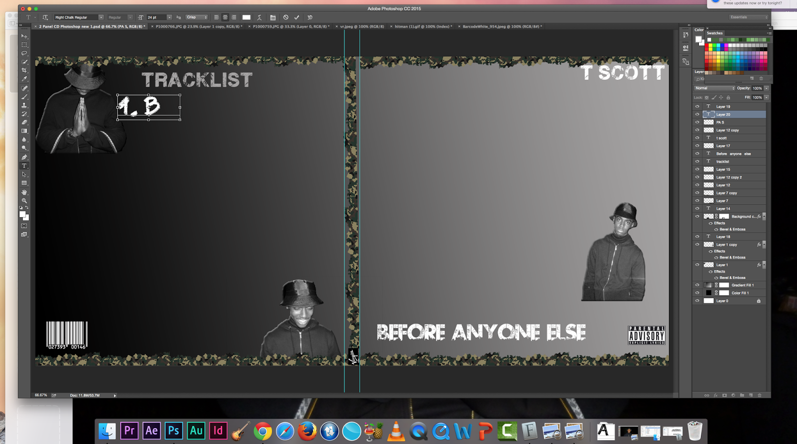
57. Screenshot of ancillary products in production
 |
| Before the grey background it looked like this but was white I did not like how it was piecing together I did not like the font used and was struggling to find the one I had in mind I wasn't too keen on the back panel picture as well. |
 |
| I then went onto experimenting more and making the background black, I also thought to try and use the picture of my main artist and feature artist of the main song, the music video 'bae' |
 |
| Finally It started to piece together I wanted to make my synergy item (bucket hat) clear and so as well as having the front panel picture I changed the back panel picture again to have the bucket hat clear on the back, he wears this outfit in one of the main base tracks in the music video. I also want to put the tracklist over this back panel, it doesn''t show his face so i know I wont be breaking the rules of design work. I also changed the font of his name, I very much preferred this and it's what I originally had in mind. |
 |
| This is the header of my website, it isn't exactly the same picture of my album cover I tried to use the album cover picture but couldn't position is nicely, I hope to change it to my album over. This picture is though also a shot from the music video 'bae'. |
 |
| The first thing you come across so far when scrolling down the homepage is the 'bae' music video, I wanted to further promote this since beside the album this is the latest news of my artist. I also want to add videos of other grime/rap artist, I noticed that Tinie Tempah did this on his home website and so was inspired from this. I feel like It's a nice way to show that artists support and promote each other. On the side you also notice how my artist will be performing and attending a summer holiday this not only lets fans know one of the places he's performing but also promotes that summer holiday hence why I included their website link to purchase tickets. (cross media promotion) |
 |
| I have a slide show of behind the scene pictures of filming 'bae' below a twitter feed and then a section about my artist. |
 |
| I've also decided that my website will soon be selling bucket hats since it's the synergy item. I also need to resize text and re position thing. I also want to add a background instead of keeping it plain, I'm thinking of making it camouflage. |
Sunday, 10 January 2016
Subscribe to:
Comments (Atom)